
Page 82 - Indigo Design Award 2019
P. 82
TRANSFORM GRADUATION IDENTITY
Shanti Sparow
Design Director: Shanti Sparrow Silver in Branding
The Transform exhibition identity was developed for the Shillington School
of Design Summer graduation exhibitions. The concept of “Transform” was inspired by the student journey – from curious observer to passionate designer. The graphics reflect the transitional stages of change in both abstract elements and typography. The exhibition identity was rolled out internationally in New York, London, Sydney, Manchester, Brisbane and Melbourne campuses.
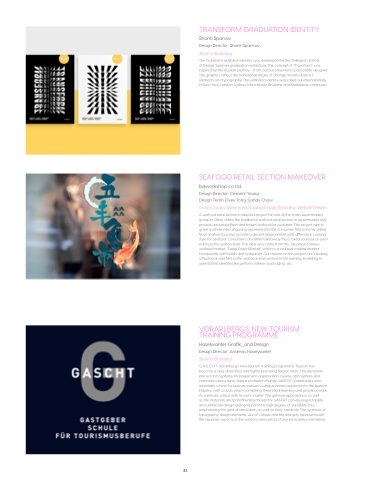
SEAFOOD RETAIL SECTION MAKEOVER
bdworkshop co. ltd.
Design Director: Clement Young
Design Team: Elvey Tong, Candy Chow
Gold in Logos; Silver in Packaging Design, Branding, Website Design
A seafood retail section makeover project for one of the chain supermarket group in China. Unlike the traditional seafood retail section in supermarket only provide uncooked flash and frozen seafood for customer. This project aim to given a whole new shopping experience to the consumer that not only selling fresh seafood but also provide a decent environment with difference cooking style for seafood. Consumer can rather takeaway the cooked seafood or even eating in the seafood bar. The idea was come from the Japanese famous seafood market: “Tsukiji Outer Market”, which is a seafood trading market incorporate with retails and restaurant. Our mission on this project are creating a flash look and feel to the seafood retail section. From naming, branding to operational identities like uniform, interior, packaging...etc.
VORARLBERG’S NEW TOURISM TRAINING PROGRAMME
Haselwanter Grafik_and Design Design Director: Andreas Haselwanter Silver in Branding
G A S C H T Vorarlberg’s new tourism training programme Tourism has become a very diversified and highly promising field of work. The demands placed on hospitality, management, organisation, cuisine, atmosphere and communications have seen a profound change. GASCHT, Vorarlberg’s new hospitality school for tourism, pursues a unique holistic approach to the tourism industry, with a dual system combining theoretical learning and practical work. As a private school with its own charter. The general appearance, as well
as the materials and print finishing chosen for GASCHT convey respectability, and additional design elements permit a high degree of variability, thus emphasising the spirit of innovation, as well as lively creativity. The synthesis of typography, design elements, use of colours and the imagery represent both the dynamic aspects of the school’s vision and its forward-looking orientation.
82
