
Page 84 - Indigo Design Award 2019
P. 84
360° RE.BRANDING FOR B2B AGENCY APTLY
REICHERT-YOUNG
Design Director: Patrick Reichert-Young
Design Team: Creative Director and Design Lead: Patrick Reichert- Young; Junior Art Director: Julia Hildebrand; Frontend Developer: Dirk Remhof; Frontend Developer and User Experience Designer: Oliver Flatow; Project Management: Jasmin Kind
Silver in Branding
Task was to rebrand the identity of the B2B consulting agency APTLY. The original brand concept offered little opportunities when it came to crossmedia / -device communication, because of its lack of a consistent signature look and visual vocabulary. Starting point of the final solution was the idea to develop a symbol matrix, based on the basic shapes of the original company logo. By applying a simple set of five rules to the matrix, more than 16,000 glyphs can be generated from this Archeform. These forms can be used across the online / offline communication, so the brand is able to express itself in a defined, unique and recognizable way. This kind of signature look gives the brand the opportunity to get recognized even if the logo / company name isn’t prominent displayed on every asset of the communication. This generates space for new ways and explorations about how the brand voice can interact with its audience. in companies can work with corporate design.
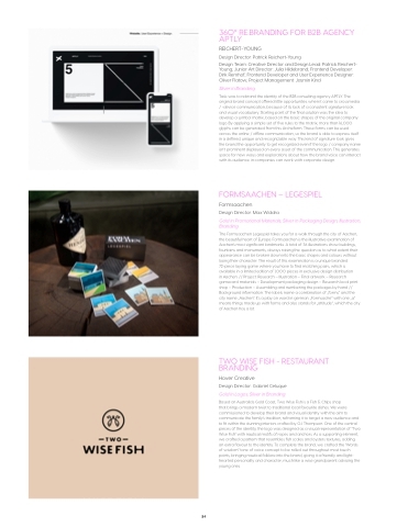
FORMSAACHEN – LEGESPIEL
Formsaachen
Design Director: Max Widdra
Gold in Promotional Materials; Silver in Packaging Design, Illustration, Branding
The Formsaachen Legespiel takes you for a walk through the city of Aachen, the beautiful heart of Europe. Formsaachen is the illustrative examination of Aachen’s most significant landmarks. A total of 36 illustrations show buildings, fountains and monuments, always raising the question as to what extent their appearance can be broken down into the basic shapes and colours without losing their character. The result of this examination is a unique branded 72-piece laying game where you have to find matching pairs, which is available in a limited edition of 1,000 pieces in exclusive design distribution
in Aachen. // Project: Research – Illustration – Final artwork – Research gamecard materials – Development packaging design – Research local print shop – Production – Assembling and numbering the packages by hand // Background information: The labels name a combination of „forms“ and the city name „Aachen“. It’s a play on word in german. „Formsache“ with one „a“ means things made up with forms and also stands for „attitude“, which the city of Aachen has a lot.
TWO WISE FISH - RESTAURANT BRANDING
Hover Creative
Design Director: Gabriel Celuque Gold in Logos; Silver in Branding
Based on Australia’s Gold Coast, Two Wise Fish is a Fish & Chips shop
that brings a modern twist to traditional local favourite dishes. We were commissioned to develop their brand and visual identity with the aim to communicate the family’s tradition, reframing it to target a new audience and to fit within the stunning interiors crafted by OJ Thompson. One of the central pieces of the identity, the logo was designed as a visual representation of “Two Wise Fish” with nautical motifs of ropes and anchors. As a supporting element, we crafted a pattern that resembles fish scales and oysters textures, adding an extra flavour to the identity. To complete the brand, we crafted the “Words of wisdom” tone of voice concept to be rolled out throughout most touch points, bringing nautical folklore into the brand, giving it a friendly and light- hearted personality and character, much like a wise grandparent advising the young ones.
84
