
Page 81 - Indigo Design Award 2019
P. 81
WIREFRAMES: THE VISUALIZATION OF ARCHITECTURE
Kilograph
Design Director: Denzil Maher
Design Team: Keely Colcleugh, Jen Agosta, Kellan Cartledge, Lienny Ruiz
Silver in Branding
Wireframes: The Visualization of Architecture presents an exploration of
the significant art and technology involved in architectural visualization.
The exhibition tells the story of two industries – architecture and computer graphics – coming together to form a new discipline. Follow the disciplines’ vibrant history to present-day through artist-created story panels, which highlight important moments in the story of architectural visualization. Wireframes is a testament to architectural visualization’s place in the arts; it is a qualitative survey of computer-generated imagery and its effect on practice and the public imagination; Past, Present, Future.
LIFE-SIZED EXHIBITION DUTCH RAILWAY STATION
BERT HOUSE B.V Design Director: Nick Put Silver in Branding
Together with the HeArtGallery foundation we designed and realized this 80-meter-long exhibition space with life-sized photos about the history of Stork. With a total of 64 panels, 1.80-meter-long and a total length of 80 meter the panels are visible at the train station platform of Hengelo. The exhibition ‘150 years City and Stork’ is about the cultural and social development that Stork has left to Hengelo (city in The Netherlands) and its inhabitants to this day.
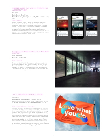
A CELEBRATION OF EDUCATION
SomeOne
Design Director: Thomas Dabner — Creative Director
Design Team: Romelle Menezes — Senior Designer, Julien Bertouille — Designer, Emily James — Designer, Rose Brennan — Account Director
Silver in Branding; Bronze in Typography
SomeOne were tasked with developing a striking brand identity that would work hard to elevate the Torrens University Australia (TUA) name and boost brand awareness, only being 5 years old as an organisation when we began work. We developed an entire ‘brand world’ that revolves around a core thought, our unifying theme. ‘Love what you do’ — which has a purity of spirit that captures what it means to be truly passionate in your field of study and subsequently in your career. The flowing, dynamic and ever morphing forms symbolise the student journey as they grow and change, revealing more intricate details over time. SomeOne created the brand identity as well as rolling it our across a raft of launch applications from prospectuses, swag, animations, on campus graphics, social assets, and extensive brand guidelines to ensure all new communications come out as strong as those at launch. This is very much the beginning in a much bigger story for TUA.
81
