
Page 95 - Indigo Design Award 2019
P. 95
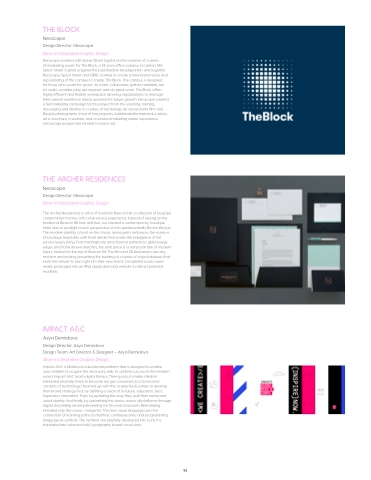
THE BLOCK
Neoscape
Design Director: Neoscape
Silver in Integrated Graphic Design
Neoscape worked with Spear Street Capital on the creation of a series
of marketing assets for The Block, a 42-acre office campus in Canton, MA. Spear Street Capital acquired the past Reebok Headquarters and together Neoscape, Spear Street and CBRE worked to create a new brand voice and repositioning of the campus to create The Block. The campus is designed
for those who yearn for space—to roam, collaborate, gather, meditate, run (or walk), socialize, play, get inspired, and do great work. The Block offers highly efficient and flexible workspace allowing organizations to manage their current workforce needs and plan for future growth. Neoscape created a full marketing campaign for this project from the visioning, naming, messaging and identity, to a series of renderings, an aerial drone film, and lifestyle photography shoot of the property. Additional informational e-blasts, an e-brochure, a website, and a curated marketing center experience encourage prospective tenants to reach out.
THE ARCHER RESIDENCES
Neoscape
Design Director: Neoscape
Silver in Integrated Graphic Design
The Archer Residences is a first of its kind in Beacon Hill: a collection of bespoke condominium homes with a full-service experience. Instead of relying on the traditional Beacon Hill look and feel, we created a contemporary, boutique hotel vibe to spotlight a new perspective on this quintessentially Boston lifestyle. The modern identity, a twist on the classic monogram, embraces the essence of boutique hospitality with fresh details that evoke the indulgence of full service luxury living. From herringbone and chevron patterns to gilded page edges and hand drawn sketches, the print piece is a storybook tale of modern luxury nestled on the top of Beacon Hill. The film and 3D illustrations are airy, modern and inviting, presenting the building as a series of styled tableaus that invite the viewer to step right into their new home. Completed assets were neatly packaged into an iPad application and website to attract potential residents.
IMPACT A&C
Asya Demidova
Design Director: Asya Demidova
Design Team: Art Director & Designer – Asya Demidova Silver in Integrated Graphic Design
impact A&C is Moldova’s educational platform that is designed to enable
your children to acquire the necessary skills, to achieve success in the modern world. impact A&C teach digital literacy. Their goal is to make children interested and help them to become not just consumers but to become creators of technology. I teamed up with the academies&camps to develop their brand strategy. First, by defining a vision of its future: education, trust, inspiration, innovation. Then, by updating the way they spell their name and visual identity. And finally, by unearthing the stories across all platforms through digital storytelling and implementing it in the real classroom. Rebranding inherited only the colour - magenta. The new visual language uses the connection of learning paths as rhythmic continuous lines and programming language as symbols. The symbols are playfully developed into icons. It is translated into cohesive bold, typography based visual story.
95
