
Page 71 - Indigo Design Award 2019
P. 71
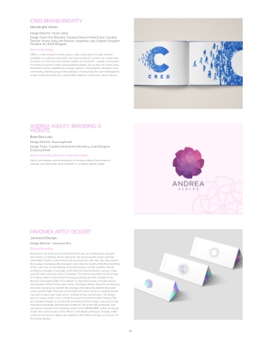
CRED BRAND IDENTITY
Meaningful Works
Design Director: Youna Jang
Design Team: Eric Boisvert, Creative Director Nate Dolce, Creative Director Youna Jang, Art Director Josephine Law, Graphic Designer Christine Ye, UI/UX Designer
Silver in Branding
CRED is a new brand in a new space, with crypto lines of credit, and the sensibility of a global community. Our logo needed to convey our community, in action, so it became the nonstop motion of Cred itself – people coming into it, moving around in it and congregating together, just as they do when using the brand. Cred is simplified to a single capital C, showing the strength in one community, and focusing on the simplicity of being here for each individual. It’s a logo made of people, for a brand that values its community above all else.
ANDREA ASHLEY: BRANDING & WEBSITE
Brain Box Labs
Design Director: Soyoung Kwak
Design Team: Creative Director Kris Nicolaou, Lead Designer Soyoung Kwak
Silver in Branding; Bronze in Website Design
End-to-end design and development of Andrea Ashley. From brand to website, we helped the client establish a complete identity online.
PAVOMEA ARTSY DESSERT
Jansword Design
Design Director: Jansword Zhu Silver in Branding
Pavomea is an artsy dessert brand that focuses on creating new desserts and snacks combining artistic elements. We picked up the great German chromatist Goethe as the brand soul, because he is the one who discovered the residue, developed the hexagon color chrome. Goethe think the meanings of the color rely on the feelings of human beings, not the scientific statistic
as Newton thought. It coincides with what the brand what to convey, “enjoy yourself with sweets in colors of feelings”. The brand logo refers to the image of Goethe which comes from his famous painting portrait “Goethe in the Roman Campagna (1786)” in Frankfurt. It is transferred into a modern linear semi-abstract form that locates within a hexagon frame. The nose on the face has been replaces by a prism-like triangle, indicating the relation between colors and the light. The logo can transfer into three modes to emphasize the concept of prism and show more contrast of lines and shapes. The design goes to a pure white color scheme to present its panchromatic feature. We use Hologram Paper to convey the brand tone. Prism shape was used as the macaroon package and hexagon shape for the small cake package. And
we pick six animals from Goethe’s poem “LILY’S MENAGERIE” as the accessory shape. The store locates at the 798 art zone, Beijing. Hexagon, triangle, white color and accessory shapes are applied to the interior designs as an echo of the brand identity.
71
