Page 73 - Indigo Design Award 2019
P. 73
SOCIALKORP BRAND IDENTITY
Rafael Maia
Design Director: Rafael Maia Silver in Branding
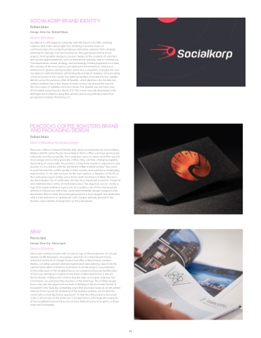
Socialkorp is a Portuguese company with the future in its DNA, creating solutions that make sense right now. Working in several areas of communication, the company proposes innovative solutions from strategic planning for startups and new businesses, through design and its many aspects, from graphic design to product design, to the creation of solid, fast and secure digital platforms, such as institutional websites and e-commerces. Communication, media, strategy and technology. Finding inspiration to create the concept of the new brand, we returned in the timeline to a historical milestone for global communication, which has completely changed the way we interact with information, eliminating the barrier of distance and providing a true revolution in the media: the artificial satellites. Ironically the first satellite did not serve this purpose, after all Sputnik, which illustrates the Socialkorp’s symbol, emitted only a few beeps in radio waves, but paved the way for
the new series of satellites we know today. The Sputnik you see here was 3D modeled using Foundry Modo 10.2. The scene was fully illuminated with HDRi light and rendered using Rebusfarm’s processing infrastructure. Post- production in Adobe Photoshop CC.
PEACOCKS COFFEE ROASTERS BRAND AND PACKAGING DESIGN
Rafael Maia
Silver in Branding, Packaging Design
Peacocks Coffee is based in Monza, Italy and it was founded by two brothers, Matteo and Riccardo Pavoni. According to them coffee can have spectacular character and flavour profile. The company’s aim is to select and offer you the most unique and exciting speciality coffees they can find, changing regularly depending on seasonality. The product comes from research, experience and passion; it is in contrast with the dominant coffee tradition in Italy. They work
to push forward the coffee quality in their country and outside by challenging expectations. A city and comune on the river Lambro, a tributary of the Po, in the Lombardy region of Italy some 15 km north-northeast of Milan. Monza is the third-largest city of Lombardy and the most important economic, industrial and administrative centre of the Brianza area. The objective was to create a logo that would exhibited a peacock as a symbol, one of the most luxuriant animals in nature, but with a flat, clean and minimalist design. Designed with the brand’s DNA in mind, the packaging present a look elegant and minimalist, with a mild reference to steampunk style. Copper, already present in the brand’s visual identity, emerge here as the protagonist.
88W
Neoscape
Design Director: Neoscape Silver in Branding
Neoscape worked closely with Cresset Group on the production of a visual identity for 88 Wareham, a boutique collection of condominium homes
in Boston’s SoWa Art & Design District, that offer crafted, hand-curated
finishes, a rooftop garden and fully automated valet parking, steps from the sophisticated allure of Boston’s South End. To tie the project’s visual identity
to the artful spirit of the neighborhood, we created a physical manifestation
of the logo–bringing a sculptural and hand crafted element to it. We did
this by literally crafting and constructing the logo as a paper sculpture first. From there, we extracted the structure of the final logo. This crafted design focus was also the approach we took in thinking of the brochure format. A newsprint “zine” feels like something you’d find and take away at an art exhibit. Instead of the typical 3D rendering of the building exterior, we treated the cover with a more illustrative approach. To that end, this property brochure
is also a showcase of the SoWa Art & Design District with large photography of the neighborhood and Specials sections featuring two local gems, a donut shop and a boutique.
73


