
Page 68 - Indigo Design Award 2019
P. 68
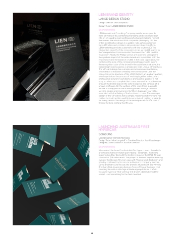
LIEN BRAND IDENTITY
LANSID DESIGN STUDIO Design Director: JIN-LIAN,HSIAO Design Team: LANSID DESIGN STUDIO Silver in Branding
LIEN International Consulting Company mainly serves people
from all walks of life, combining marketing and communication
into an art, guiding each professional’s characteristics to market themselves. We introduce LIEN’s corporate philosophy into the entire identification design in a golden ratio. When customers
face difficulties and problems (A), professional analysis (B) on
LIEN marketing provides customers with the solutions (C). The intersected area (C) of the concentric circles (A) and (B) stands for the “Interpretation Communication” between the “LIEN” and the “Customer”. Finally, the Phillips screws are added to strengthens
the symbolic imprint of the entire brand and symbolizes both the importance and the balance of LIEN. In the color application, we center on the style of the company’s leading person to extend
the recognition color of the brand. In the usual black suit style, the faded bright colors express a simple and calm unique atmosphere. The VIP card design has a simple and uncommon visual sense, which helps to establish credibility. The overall sense uses the concentric circle structure of the LOGO to form an auxiliary pattern, which symbolizes the process of working together to become a professional lecturer in LIEN. Being a professional speaker is not easy, so when you complete the course, we use the most intensive cross of the brand logo on the card to express the concept of a unique profession. On the surface of the card, there is a matte texture. It is mapped on the auxiliary pattern through different viewing angles and environments. When shaking it, you will be reminded with the feeling of the hard-won course. The envelope design of the VIP card is not so simple, meaning that everyone has clothes that suit her/him well. Not every style of clothing is suitable for every person. The design of the envelope calls for the spirit of finding the best clothing that fits you.
LAUNCHING AUSTRALIA’S FIRST HYPERCAR
SomeOne
Lead Designer: Romelle Menezes
Design Team: Max Longstaff — Creative Director, Josh Roseberg — Designer, Laura Coulson — Account Director
Silver in Branding
We created the brand for Australia’s first hypercar and the rebirth of a historic name in motor sport racing — Brabham. The brand launched on May 2nd with the limited release of the BT62, 70 cars at a cost of $1.8 million each. The project is the next step for a racing dynasty that began 70 years ago with F1 great Jack Brabham and is today continued by his son, race driver and company founder, David Brabham. Like the car, the brand is infused with the winning Brabham DNA, leveraging features from a 70 year heritage and blending this with a new age attitude appropriate for a track- focussed hypercar ‘that will truly test driver’s abilities behind the wheel’ — not something for the faint-hearted.
68
