
Page 62 - Indigo Design Award 2019
P. 62
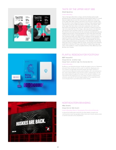
TASTE OF THE UPPER WEST SIDE
Shanti Sparrow
Gold in Branding
Taste of the Upper West Side is a large scale food tasting event proudly presented by the Columbus Avenue Business Improvement District. It is a much beloved neighborhood event that showcases the significance and scope
of the Upper West Side’s culinary community. The event hosts over 80 chefs from the district’s best restaurants that serve tastings of their signature dishes. The event runs over two nights and attracts more then 3,500 guests. Taste
of the Upper West Side strives to invite new restaurants each year, some
that haven’t even opened yet, to give the community a chance to meet the chef and sample their foods. The range is deliciously diverse, and attendees will experience the wonderful cuisines of our area’s finest restaurateurs. Proceeds from this event go back into the community and help fund selected neighbourhood projects. The brand identity for Taste of the Upper West Side is based on the concept “cooking/baking is as much a science as it is an art”. The overall brand mimics the styling of an art exhibition and the graphics are inspired by abstract minimalism. The graphic elements are representative
of the duality of precision and freedom within cooking/baking. The precise, ordered, regimented elements are illustrative of the mentality of perfect fine dining and science of baking. While the organic, unstructured wave elements speak more to the free, off recipe, artistic style of cooking. These opposing styles come together to create a beautiful harmony in their differences much like they do in cooking.
PLAYFUL REDESIGN FOR POSTPONY
BERT House B.V
Design Director: Jonathan Vuijk
Design Team: Jonathan Vuijk, Tom Arends, Nick Put Gold in Branding
PostPony, as an international player, handles the logistics process of shipments between China and the rest of the world. To clarify this shipping process,
we created a recognizable and playful design with shapes and lines to create movement. Big bold headers paired together with a nice introduction text, which makes PostPony loud and clear in their communication. This has been implemented throughout the design of the website. In addition, it was important that the shipping process was simple enough to understand by everyone, especially for the Asian target audience. So we opted the use of icons and gave them a prominent place at the website.
NORTHEASTERN BRANDING
Mike Swartz
Design Director: Mike Swartz
Gold in Branding; Silver in Typography, Promotional Materials
A rebrand for Northeastern University, plus their athletics program. We commissioned custom typography, redrew their iconic mascot, and provided a vision for execution across all platforms.
62
