Page 187 - Indigo Design Award 2019
P. 187
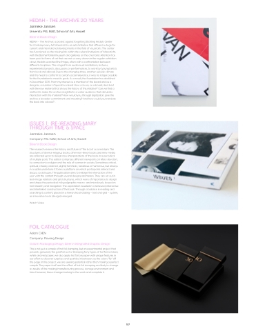
HEDAH - THE ARCHIVE 20 YEARS
Janneke Janssen
University: PXL MAD, School of Arts, Hasselt Silver in Book Design
HEDAH – The Archive; a protest against forgetting Stichting Hedah, Center
for Contemporary Art Maastricht is an artist initiative that offered a stage for current and international developments in the field of visual arts. The center has functioned as the missing link within the cultural institutions of Maastricht, with the Bonnenfantenmuseum and galleries on the one hand. Attention has been paid to forms of art that are not so easy shown in the regular exhibition circuit, Hedah searched the fringes, often with a confrontation between different disciplines. This ranged from audiovisual installations, lectures, experimental projects, discussions or performances, to work by (young) artists from local and abroad. Due to the changing times, another subsidy climate and the need to conform to certain social relevance, it was no longer possible for the foundation to meet its goals. As a result, the foundation has abolished in December 2015. From my interest as a member of the board and as a designer, a number of questions raised: How can we, as a board, deal best with the raw material that shows the history of this initiative? Can we find a method to make the archive insightful to a wider audience that stimulates interaction with the material? How would you, through digitization, give the archive a broader commitment and meaning? And how could you translate this back into a book?...
ISSUES 1 : (RE-)READING MARY THROUGH TIME & SPACE
Janneke Janssen
Company: PXL-MAD, School of Arts, Hasselt Silver in Book Design
The research reviews the history and future of ‘the book’ as a medium. The structures of diverse religious books, other non-linear books and new media are reflected upon to design new interpretations of the book in a periodical of multiple parts. This edition comprises different viewpoints on Mary devotion, its connection to religion and the role of women in society. Sometimes critical, spiritual, cheeky, abstract, slightly feministic, rebellious or humorous, but always in a subtle undertone. It forms a platform on which participants interact and discuss social issues. The publication aims to enlarge the interaction of the
user with the content through several design parameters. They are set out in text-image relations and grid structures, which were of importance to design and shape the periodical in (typo)graphic macro- and microlevels, based on non-linearity and navigation. The exploration resulted in a renewed, interactive and interlinked construction of the book. Through a balance in reading and searching its content, placed in a hierarchical rotating – text and grid – system, an innovative book (design) emerged.
Watch Video
FOIL CATALOGUE
Adam CHEN
Company: Flowing Design
Gold in Packaging Design; Silver in Integrated Graphic Design
This is not just a sample of hot foil stamping, but an experimental project that presents genuinely the gold foil as it is. Stamping forty types of hot foil on black, white and red paper, we also apply hot foil on paper with unique features in our effort to discover surprises and sparkles in between, as the colors “fly” off the page. In this project, we are seeking potential rather than making a perfect sample. The paper itself and the effect of hot foil stamping are likely to change as results of the making/manufacturing process, storage environment and time. However, these changes belong to the work and complete it.
187


