
Page 106 - Indigo Design Award 2019
P. 106
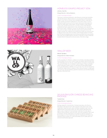
HOMELESS GRAPES PROJECT 2016
Jimmy Can Do
Design Director: Jimmy Muldoon Gold in Packaging Design
This project is all about giving back, with all services and product donated, with all profit going to those in need of a second chance at life. Homeless grapes is very close to my heart, and I designed this label to celebrate this project and the good that’s happening on such a taboo topic in society. I wanted this label to bursts across the screen with passion and purpose to reflect the similar ethos of the product. The first Homeless Grapes Project started with one little Facebook post. Jock Harvey, from Chalk Hill Wines, posted that he had a surplus block of vines and anyone was welcome to them if they made a donation to charity. Our CEO André saw an opportunity: why don’t we make a cheeky little shiraz instead and send 100% of the profits to charity? He contacted Jock and the rest, as they say in the biz, took a shitload of hard work and was totally worth it. People jumped on board the HGP train immediately, keen to be involved and help in any way possible. The result? An incredible $36,000 donation to the Hutt St Centre in Adelaide. Another $44,000 followed from the proceeds of the 2016 vintage.
WALLOP BEER
Merril Cledera
Design Director: Merril Cledera Gold in Packaging Design
As the popularity of craft beers continues to accelerate, competing aesthetics have emerged: the two most common styles are spartan, logo-forward, sans- serif minimalism and over-the-top, colorful displays of tongue-in-cheek humor. The goal with Wallop was to maintain a certain degree of approachability while evoking the creative science of craft beer brewing. Making Wallop boring and intimidating is definitely not a good idea. Thus, the best design that would fit the Wallop brand is a balance in the contrast between a simple bold sans-serif logo and unpretentious geometric illustrations prominently featuring figurative, natural elements.
WUJUN PAVILION CHINESE BEANCAKE PACKAGE
Yuexin Huo
Design Director: Yuexin Huo Gold in Packaging Design
Package design for a product line of Chinese beancakes with 4 flavors: Mung Bane Cake (green-bean cake), Soybean Cake (yellow-bean cake), Adzuki Bean Cake (red-bean cake), and Mixed-ingredient Cake (cake with eight treasures). The product names are spray painted with flourescent paints to give a bright look. Each package would have 12 small cakes of different surface patterns, which are laser-cut on the package for their visual presentations. Product information is UV-printed on the front and back of
the packages. It’s a mid to high end product line targeting both Chinese and international (U.S.) markets. It’s constructed entirely out of cardboard for an environmental friendly approach.
106
