
Page 77 - Indigo Design Award 2019
P. 77
BLAAFROST MUSIC FESTIVAL
Natiwe Design Agency
Design Director: Frank Trana
Design Team: Frank Trana, Ole Ekker, Norwegian Creations.
Silver in Branding, Interaction Design; Bronze in Integrated Graphic Design
A new festival identity for 2016
. My mission was to further develop the festival’s identity by linking it even closer to the shipyard’s rich history. This was achieved by using maritime symbols and language (flags and morse) to create messages for the festival’s marketing.
Objective: Surprise and engage. We created an interactive experience
for festival participants by exposing them to posters that responded when walking by. Six sensor-controlled posters were equipped with smoke machines and lights. Triggered by movement, a tiny computer released smoke from the posters and turned on the frosty blue light.
All visual elements and symbols were also used on the festival’s digital platforms (website, Instagram etc).
Watch Video
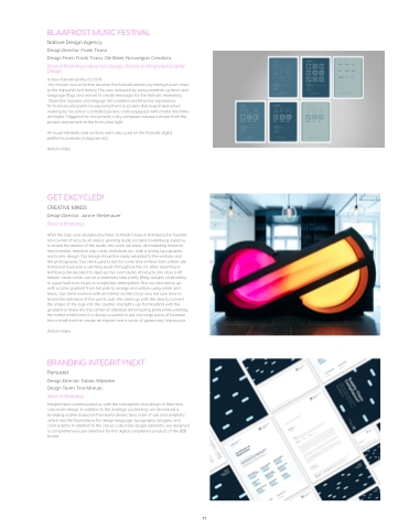
GET EXCYCLED!
CREATIVE MINDS
Design Director: Janine Weitenauer Silver in Branding
After the logo was designed by Peter Schmidt Group in Hamburg the founder and owner of Hicycle an indoor spinning studio located in Hamburg asked us to brand the interior of the studio, the work out bikes, all marketing material, merchandise, member ship cards, invitations etc. with a strong typographic and iconic design. Our design should be easily adapted to the website and the photography. Our client used to live for some time in New York where she trained at Soulcycle a spinning studio throughout the U.S. After returning to Hamburg she decided to open up her own studio. At Hicycle one does a 45 minute cardio work-out on a stationary bike partly lifting weights while listing to super loud rock music in a nightclub atmosphere. First we decided to go with a color gradient from hot pink to orange and yellow, using white and black. Our client worked with an interior architect but was not sure how to brand the entrance of the sports club. We came up with the idea to convert the shape of the logo into the counter and light is up from behind with the gradient to make this the center of attention and meeting point while entering the rather small room. It is always essential to put one large piece of furniture into a small room to create an impact and a sense of generosity/ impression.
Watch Video
BRANDING INTEGRITYNEXT
Persuaid
Design Director: Tobias Wibbeke Design Team: Tina Marusic Silver in Branding
IntegrityNext commissioned us with the conception and design of their new corporate design. In addition to the strategic positioning, we developed a branding system based on the brand drivers trust, ease of use and simplicity, which laid the foundations for design language, typography, imagery and color palette. In addition to the classic corporate design elements, we designed a comprehensive user interface for the digital compliance product of the B2B brand.
77
