
Page 120 - Indigo Design Award 2019
P. 120
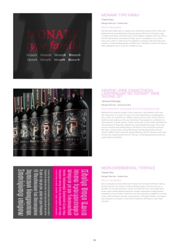
MONARK TYPE FAMILY
Yuexin Huo
Design Director: Yuexin Huo Silver in Typography
Monark type family aims to capture the conflicting emotions from Crime and Punishment by presenting them through unique letterforms. It features large x-heights and heavy serifs that help connect glyphs together and a top-heavy formal characteristic presented at larger sizes. It is designed to be a work- horse type with no compromise for legibility at small sizes. Monark features 8 weights in total including upright and italic fonts. The Italics combine the tension with calligraphic forms in an non-traditional way.
GRAPHIC-WINE SYNAESTHESIA: LADYPENGUIN “DICTIONARY” WINE TASTING SET
Jansword Design
Design Director: Jansword Zhu
Silver in Illustration, Typography; Bronze in Packaging Design
Different from western market, China consumer is still unfamiliar with wine.
The “Dictionary” is a series of classic red wines launched by LadyPenguin in this context. Choosing from six different grape species in the world to form a textbook-style tasting set. We used Six kinds of typography to symbolized six characteristic of grape species, which can known as Typo-Wine Synaesthesia. The illustration of Figurative animals also symbolized the feature of the Wine species. And the surrounding things is the flavor of the species(for example, We draw crystals, lemons and linden flowers for Riesling) Dante stands for Gruner Veltliner, Didot represents elegant Riesling, and Art Nouveau-style fonts for Moscato, Futura Inspired font for The new world representative Syrah, the gentle Optima for Merlot.
NEON EXPERIMENTAL TYPEFACE
Yuexin Huo
Design Director: Yuexin Huo Silver in Typography
Neon is designed to hide information instead of showing information. Various design decisions are made to make individual glyph as hard to pick up as possible. As an Latin typfeace, it writes vertically from up to down like some Asian scripts while keeping letterforms upright, making the reading rhythm unfamiliar to most readers. Letterforms are also extremely simplified to provide a very uniform texture and any characteristics of traditional letters are largely discouraged. As a result, it is very hard to read but still keeps its soild visual structure.
120
